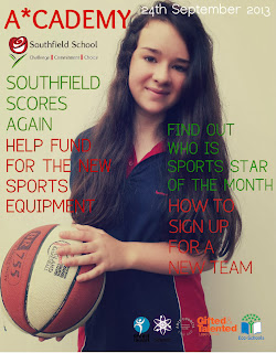
I have found these two magazine front covers online I am going to compare them to my final front cover, to start I will look for the differences and similarities. Firstly I prefer the first one as it looks a lot more, interesting, it is clear and has sell lines the same as mine and focuses on two main colours orange and white, I also had two colours green and red. However I chose the school colours whereas the first one hasn't as their school uniform is blue, I think they have chosen those colours as they stand out because they contrast. The image is of a close up whereas mine is a mid shot and 'The Lion' is a long shot. The masthead is in upper case and lower case to show how it is important, however the word 'parent' isn't which I think is quite strange, mainly because the reader of this is an adult as the children on the front cover are of a younger age. 'Parent' could be in capitals to show they are important to the school as they are the audience of the magazine. As well as this the sell lines are very engaging as they could win a holiday whereas mine is very supportive of the school and nothing else. The sell lines are positioned around the picture similar to mine and the exclamation at the top makes the magazine quite friendly. When I improve mine I will probably include this as it makes it more persuasive yet adds a bit of humour.
The second magazine is very plain however it stands out, the picture is interesting as it shows something that has happened outside of the school whereas both mine and the first one are of pupils in some sort of uniform for example pe kit. The second magazine has their school logo at the bottom which is the same as mine. However when I look at the magazine front cover the date is from 2012 to 2013 that is why I think that they don't have any sell lines, mainly because it is focusing on the year and therefore they would have to pick from a lot of events that have occurred during their school year. They use sans serif the same as both of the magazines I think that this is because they are for students and parents so they have to aim to satisfy both age groups, using serif would make it more formal as it would aim to have an older audience. This school magazine could add some form of sell lines to make the target audience clear, but perhaps they would prefer not to so everybody is targeted rather than just one person.
As I said above the best magazine front cover is the first one as the picture is engaging the sell lines persuade me to open to read the rest, the structure was planned beforehand and their positions of text and images are clear and makes it easier to read. I would defiantly change my font and could put headings to different sell lines to make it look more defined.


This is a very good start so far Rhiann, well done. You are using media terms correctly in your analysis. Could you also blog what you have learned about ideology and representation in music, what denotation and connotation mean in terms of media, and what you have learned about research and what methods you will use and why.
ReplyDelete