Monday 30 September 2013

Magazine covers and their ideology

Many music magazine front covers reflect the ideology of their genres in visual styes and language. Here are a few Front covers and how they show their ideology.

SPIN is known for having many different celebrities on their front cover from Florence and the machine to Eminem. Therefore I believe that SPIN doesn't have a specific genre, this magazine would be ideal for me personally as I listen to any music that is good I have never made an assumption to any type of music. SPIN has made this clear by listing some artists of different genres for example 2 chainz is a hip hop artist and The xx is very slow and is indie rock. With only a few sell lines on the front cover it makes it easy to read for all audiences, also the image of Azealia Banks is very fun as she has obviously not been positioned which I like. The image is taking up the front cover to show how she is important and in the main sell name her name is in capitals. The soft colours around the edge engage the pop readers and blues, then the bright colours and her position influence the rock audience and also the red of the masthead. Also the masthead is normally under the photo however here it covers part of her hair. The colours are used in a lot of magazines so they have recognised that they are good colours to use as they must make the magazine look sophisticated and therefore sell well. Although red connotes danger I think in this situation it is to catch peoples eyes, with no price or bar code it again shows simplicity. If I saw this magazine in the shop I wouldn't exactly know what genre it is aimed at however it is fun and sophisticated so I believe that most genres will like this magazine.

This magazine has a specific audience of hip hop and rap. It conveys the ideology from the main image of Lil Wayne to the font of the text. The sub heading 'who got the juice? Steroids invade hip-hop?' already tells how they are targeting the magazine to. Also they include the word steroids which doesn' really have anything to do with the music however they add it to try and engage the hip hop readers so they will buy the magazine. Lil Wayne is in a very hip hop pose with his hand on his chin and his mouth in a disgusted position, his hat is bright red which blends into the background colour well, if it was blue then it would stand out more however I think it would make it cheap. The font is very big and you see this font on the hip-hop stars jewellery therefore people know that this magazine is aimed the hip-hop genre. Also Lil Wayne doesn't look very eager to be there which I think will possibly go with the article inside the magazine. The main colour is red which connotes danger and also his tattoos could also suggest this, maybe their audience likes this and that is why they buy the magazine. In addition the sell lines on the right lists some big hip-hop names they are again selling their magazine from just the first page.

Adele is a very big celebrity and Q have made her the star of the 300th issue which says a lot about the popularity of the magazine. The ideology is shown through the image and the sell lines mainly on this front cover. There is a pun on the front cover as Adele has obviously stood in front of a fan and the sell line 'blows us away' makes the magazine have a personality. They drop some big names such as Paul Mcartney and Liam Gallagher which makes the magazine very popular as most people have heard these names. Also the sell lines on the left are in line which makes the magazine look sophisticated and well made. In addition the big gold circle to say the '300th issue' is eye catching and I would buy the magazine because of this. The colour scheme is red, white and black to match the logo exactly the same as the other two magazine front covers. The close up shot of Adele shows how she is flaunting her image just like she said in her sell line. Q magazine has made this issue available for everybody as there is pop, rock and classics.

The ideology of this magazine is shown by a lot. It is a very busy page from a mid shot picture to cartoon characters and competitions. The  picture is very dramatic and the title is covered by the stars head. Black connoted death and gothic images which goes with this genre as it is gothic and rock. The different fonts confuses me as I don't understand why they have a bright yellow text in the middle of the page, however it could be the logo for the band in which the singer comes from. Although it is very busy it makes it more interesting and gives a lot of things to read once you have paid for it so it is defiantly worth the money. The circles give the magazine a bit more depth as it isn't all the same, also the blood that is dripping from them goes with the image as the arrows that are piecing him will make him bleed and these are show by the information in the circles. The audience that 'HAMMER' are focusing on will defiantly buy this issue as it is selling the magazine very well.   


Ideology, connotation and denotation

Ideology- Is a belief, every musical genre has an accompanying ideology for example rock, they are aggressive; literal in what they say and they are concerned about professionalism.  
They divide them into a dichotomy here is an example.

Pop                                       Rock

Clean                                    Dirty
Calmer, quieter                      Aggressive
Non-sexual                            Sexual
Euphemistic                           literal
No drugs                               Drugs
Happy                                  Angry, Unhappy
Professional  'good                 Appear to be less
at singing and playing             competent/ concerned 
                                           about professionalism
Apolitical                               Political 
Fake                                    Authentic
Money                                 Making a statement


The Ideology of the genre affects all aspects of its representation. Music magazines will reflect the ideology of their genres on visual style and language.

Semiotics is the study of signs. In media we use the terms signified and signifier, signified is the thing itself and signifier is the thing that we use to represent the thing itself.

In earlier stages we saw these as connotation and Denotation.

Connotation- is meanings we ascribe to the specific thing that we are talking about. How we will use this in our media work? If we look at a logo we can see the colour and the font. The colour red could suggest danger as we signify this with the colour, if the font is bold then we connote it to be very important. 

Denotation- is the thing itself, like the guitar on the front cover is just a guitar.


Research Methods


To create my music magazine I will need to use research methods for gathering the information needed so that the magazine appeals to the target audience.

The main research methods are:
Primary - this is research you carry out personally
Secondary - research you gather from other people
Quantitative - this is when you carry out questionnaires/surveys and you look for a pattern or trend within peoples answers/responses.
Qualitative - this method investigates the why and how of decision making and people's opinions, ideas and thoughts and feelings.

Examples of Primary research methods are:
Questionnaires 
Interviews
Polls/Surveys
Focus Groups (a group of people you get together and ask questions too)
Email/Text/Letter 

One advantage for questionnaires: they
 can gather information quickly; they are easy to create and you can get direct answers.

One disadvantage is that people can lie and they can be time consuming. 
One advantage for surveys is that they are not expensive and they can be informal if that is what you wanted in your magazine.
One disadvantage is that people might not be interested to answer and they may again be lying. 
One advantage for email is that it is cheap and it is easy to get peoples opinions.
One disadvantage is that it can be reported as junk mail and it also could be ignored.

Examples of Secondary research methods are:
The internet
Books
Newspapers/Newspaper archive

One advantage for the internet is that it is free and you can gather a lot of information from specific websites. 
One disadvantage is that the information on the websites could not be reliable and maybe taken from other sources first.
One advantage from books is that it is mostly correct information and it is easy to find the information you need.
One disadvantage is that it will be expensive if you buy the books you use.

My research methods that I will tend to use will be Primary and quantitive research because they are an easy way to collect the data that I require for my magazine and they are the easiest ways to find opinions on the key features, such as the price, the title and the main one how it attracts them and what they like and dislike about my front cover.

The Male Gaze


Look at the male gaze and comment on your view? Do I agree? How is the male gaze theory reflected in music magazine cover?


The MALE GAZE was created by Laura Mulvey and she states that in film women are typically objects, this is normally shown by the control of the camera (the gaze), the different camera shots of the actresses are adapted to the target audience who are mainly men. Although Mulvey wrote this in 1975 it still applies today, despite the growing number of movies targeted towards women and that feature female parts. Though it was introduced as part of film theory, the term can and is often applies to other kinds of media, it is often use in critiques of advertisements, television and magazines. I do agree with this theory, most music videos or films you see in the 21st century make the females more attractive for men for example how they are standing, what they are wearing and the angle in which the photo has been taken. I do believe that the camera acts as the 'male' eye and I find this very one sided as if I wanted to watch a specific film that would mainly be aimed at men, then I would see a  woman in skimpy clothes, and looking very provocative which makes me feel sometimes uncomfortable. However I know that the media will not change as they sell a lot of their product because of the make gaze.


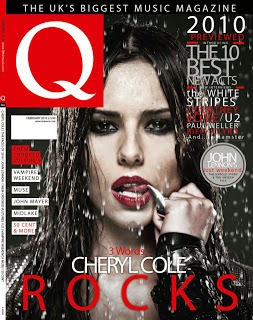
If we take this magazine as an example we can see that Cheryl Cole is licking her ring whilst water is being dripped on her. Also the masthead is at the bottom where men would mainly look first if I was being stereotypical . With Cheryl in very dark make up it seduces the male audience and makes them buy the magazine. With the image just a head shot it makes it a bit more personal and the image is obviously not taken outside so the photographer knew what he wanted to capture and making the rain go on her hair again makes it more sensual. 

The key things that we look for when we are talking about the male gaze on the front covers of  magazine are: The angle of the image; the clothes that the person on the front is wearing; their pose; how they look; where they are and the focus on specific body parts. 

Wednesday 25 September 2013

Comparing a real school magazine with my final piece


I have found these two magazine front covers online I am going to compare them to my final front cover, to start I will look for the differences and similarities. Firstly I prefer the first one as it looks a lot more, interesting, it is clear and has sell lines the same as mine and focuses on two main colours orange and white, I also had two colours green and red. However I chose the school colours whereas the first one hasn't as their school uniform is blue, I think they have chosen those colours as they stand out because they contrast. The image is of a close up whereas mine is a mid shot and 'The Lion' is a long shot. The masthead is in upper case and lower case to show how it is important, however the word 'parent' isn't which I think is quite strange, mainly because the reader of this is an adult as the children on the front cover are of a younger age. 'Parent' could be in capitals to show they are important to the school as they are the audience of the magazine. As well as this the sell lines are very engaging as they could win a holiday whereas mine is very supportive of the school and nothing else. The sell lines are positioned around the picture similar to mine and the exclamation at the top makes the magazine quite friendly. When I improve mine I will probably include this as it makes it more persuasive yet adds a bit of humour. 

                         
The second magazine is very plain however it stands out, the picture is interesting as it shows something that has happened outside of the   school whereas both mine and the first one are of pupils in some sort of uniform for example pe kit. The second magazine has their school logo at the bottom which is the same as mine. However when I look at the magazine front cover the date is from 2012 to 2013 that is why I think that they don't have any sell lines, mainly because it is focusing on the year and therefore they would have to pick from a lot of events that have occurred during their school year. They use sans serif the same as both of the magazines I think that this is because they are for students and parents so they have to aim to satisfy both age groups, using serif would make it more formal as it would aim to have an older audience. This school magazine could add some form of sell lines to make the target audience clear, but perhaps they would prefer not to so everybody is targeted rather than just one person.
As I said above the best magazine front cover is the first one as the picture is engaging the sell lines persuade me to open to read the rest, the structure was planned beforehand and their positions of text and images are clear and makes it easier to read. I would defiantly change my font and could put headings to different sell lines to make it look more defined. 

Contents page

We were asked to create a plan of a contents page. This is my final result and I was pleased about how it turned out. Using a collage makes it a bit more interesting and the red shows importance and it is the school colours. Also I used the handwriting font as it makes it more personal as it is what the student or parents want to know about this months activities. The topic was made a lot clearer to the readers as I specifically chose the sports images. The writing could be smaller to add more information on what is going to be inside the magazine and the font I might change as it different from my front cover making it look as though it should be a different magazine altogether.

Tuesday 24 September 2013

My Second Magazine Front Cover


This is my second attempt at making a school magazine front cover. I do believe that it is an improvement from my first one as the picture is clearer, the writing is more informal, the heading is good as it makes the target audience clear. The font is sans serif so the younger and older generation can be targeted as it is a school magazine, also it makes it look alot more friendly. In addition the sell lines I have placed just slightly over the mid shot. They mainly are statements with one being a commandment 'HELP'. Also I edited the photo which was my first ever experience of doing this using the free website pixlr, I found it confusing to begin with but then I found what I was doing and it seemed to work ok. The final product I am pleased with, I would change some parts for example the bottom left corner needs some text or another picture, the font could be more interesting and I could enlarge the logos. I used the colours red and green as they are the school colours. All in all I have enjoyed making my first magazine front cover. 

Thursday 19 September 2013

My first school magazine front cover

This is my first piece of media work, we were asked to create a front cover for a school magazine. The only information that we were told was to include a midshot of a student. My work is not the best and I would improve it by enlarging the picture, putting less text on and making it a bit more informal. Hopefully my next magazine front cover will be a big improvement from this.

Friday 13 September 2013

My First Post

I am currently writing my first post on my blog that will allow me to present my work that I will produce in AS media. I will post my work frequently and keep up to date with all the task that I have been set. Starting with a magazine front cover of our school and finishing with a music magazine front cover, I will be focusing on these and writing about how and why I designed them like I did. With a few more tasks in between my account will show my current project that I shall be working on.