Thursday 28 November 2013

A few of my favourite pictures


Original Photos

IMG_3151IMG_3106IMG_3099IMG_3079IMG_3073IMG_3064 (1)
IMG_3063 (2)IMG_3062

Prelim of Double page spread

So this is my first ever double page spread. I have used the article that I have previously posted on my blog and used pixlr to create the double page spread. It was quite easy to use however some of my writing you can not see and also it is not in line which makes it look less professional. I did want to put the pull quote in the middle of the text however not all of the text would fit and it would then go onto the picture of The wombats which would of made the text less readable. I used a white background first then added a picture of The Wombats which I found on google images, then as I wanted the magazine to be quite vintage looking I found an effect to make the whole page look as though it had in stains on it. I really like this effect and I shall ask people who contribute to my questionnaire about this as I would like to here some feedback. I would defiantly change the pull quote as it is not really indie and also I think it would have to be WERE not WAS which was a big mistake! Also it did take me a couple of attempts at creating the black and white text as I had to do each word separately and then put them together however I do think it looks good. I have changed the pull quote which you can see underneath the post! In addition I do like the font which is 'aaargh' as I think it looks a bit more polished and it makes the words clearer. I could change the picture to the other side and see how it works that way to play around with it and change it, however the next double page spread I will create will be my my first draft of my prelim so I shall see using my feedback which way the image should be.

Wednesday 27 November 2013

Change Of Technology

As I have earlier mentioned in my blog I will be using my camera and a tripod however once I got to my location the camera ran out of batteries I did take spare ones but unfortunately these ran out as well  ( I blame it on a dodgy pack). Therefore I had to use my phone to take the pictures, this then didn't allow me to use the tripod so I had to be extra careful of taking them to make sure that they were in line and straight. The camera on the iphone 5 is very good and the photos looked quite clear, also it was a lot easier to put them onto my computer as they sync automatically. This was a very last minute change however I was able to handle it easier than I thought.

Tuesday 26 November 2013

Indie Music videos

I thought that as I am soon approaching my final task it would be a good idea to put some music videos up of indie music groups. This would be good to see as they have a certain image that I will have to put across also some of the music videos could give me ideas for where I could take my image, how to dress my model and also what sort of target audience I am aiming for.

I think this Arctic monkeys video is ideal to show how I want the feel of my image to be, I would like it to be outside and very relaxed. Also the video is in black and white which is one of the effects that I will use. However I will not be using a tractor!

The next video is by Two Door Cinema club again this is black and white so I now know that I can have a black and white or sepia effect on my front cover as many indie stars use it in their music videos.
                       
The next is from Bloc Party which is a very famous band and this song is very popular again it is in black and white however they have a pop of colour throughout this looks good. In addition it contrasts with the black and white however I can not do this effect if I am taking the image outside.

Shooting schedule

I have chosen my model for my main task and shall be taking photos in a few days. This is to make sure that I do not waste any time, also to make the most of it. I have made a shooting schedule for the day.

Firstly I will go into school to book a tripod as I will be using my own camera, however using the tripod will be difficult as I have never used one before so I will try and figure out how to use one before I take the picture so it will not waste any valuable time. Also using a tripod will make my pictures look professional as they will be straight which can make the editing process easier. 

I have said to my model how I would like the pictures to look as well as where I would like to take them and how I would like her to dress. She is also a fan of indie music so she gets my vision. I asked her to wear a dress and some wellies as we would be outside however nether of us have any so we decided on boots.  Also I have looked at the weather forecast and it will me mild but as I am only going to allow us to be outside for a couple of hours so she will not need a hat or gloves or even a hot water bottle, also having extra items will make the time short as we will have to take them off a put them back on again. I have decided that I will have Noel's hair (my model) up for the start and then see if the wind is up to get some shots of her hair blowing in the wind.

As I have a part time job it is difficult to fit in the day of shooting fortunately we had a day of school which allowed me to take my media photos in the middle of the day and to also post some of the original photos that I will take.  

I have contacted my model and we have set a time of 1 o'clock this will make the photos have a bit of sunlight which is what I would like. We will both walk to my location which is now wickstead park it will only take 10 minutes therefore it will allow us to have more time shooting. 
Once we get there I will find the best possible location to take the first images and set my tripod out with the camera that I hopefully will now know how to work. I will have to take Noel to different locations however I want the same feel throughout, at the different locations I will spend at least 10 minutes. Also after each location I will look through the photos to see which ones I like and do not like and delete them as it will take me less time to look though and edit.
Once we have finished shooting we will both walk back and look at the photos that we have taken during the day. Noel has a time limit that she has to be home by 3.30 so that gives us 2 and a half hours to shoot which is plenty of time.

Plan of the day

10.00 Go into school and book a tripod
12.00 Get everything ready for the shoot and make sure I know how to use the tripod
1.00 Meet Noel and walk up to Wickstead park
1.15 Look at possible locations and set up the tripod
1.30 Take the first images 
1.40 Look at the images and discuss with Noel her thoughts and opinons of the images that I have taken
1.45 Walk to a different location and take some more images
2.00 Have a quick break and maybe go to the cafe and have a drink
2.30 Again look for a good location thinking about the front cover, dps and contents page.
2.40 Hopefully buy then we will have enough shoots as it will gradually get colder and I do not want my model to be standing in the cold.
2.50 Walk back home
3.00 Upload the photos on my laptop                                                                                                                                                 

Monday 25 November 2013

Audience Pleasures

When it comes to making my magazine I will have to ensure that my product will attract the target market is vital. Not taking into consideration of my target audiences interests and opinions could result in them not buying my product. As target audience is extremely important in media I will make sure that I will focus on how my magazine will appeal to my target audience. Here are a few things that are known to make a magazine sell.

What are Audience Pleasures?

They are a set of techniques that a magazine will use to persuade an audience to buy their magazine and to maintain that readership. They are things that people like that make them feel good, how people spend their free time, how something is presented to suit their audience and what the magazine thinks the audience want.  

One of these is direct mode of address which is how the magazine speaks to the reader by the use of colloquial language which is language that is personal to you for example slang words. Also personal pronouns which allows the audience to feel as though they have a connection with the magazine, these include 'you're, I, We, Us, You, our. This will allow my magazine to be a bit more personal to my target audience. Also imagery is used that will appeal to the specific audience.

Secondly a lot of magazines give freebies to their audience, firstly this attracts new customers and old. These could be cds, downloads, competitions and even vouchers. Customers love the sense of being given to as they can feel as though they are having the magazine for free as they are paying the price of the free item and getting the magazine free.

They are a good way of giving information to fans of that certain genre. Some information that magazines could give are tour dates, charts and interviews.

I will defiantly use this one humour! I will want my magazine to have a sense of humour as that us what I look for in a magazine and I believe that my target audience will like to see this in a magazine.

'Ritual Pleasure Of Consuming Of Readers' this is when people subscribe to a magazine so they get the magazine every week when it first comes out and they have it even if it is a popular issue and is normally sold out. 

Belong for self definition is another point that readers like to follow as they want to talk to people with the same interests and interact with people that enjoy the same hobbies as them. Although people can talk to people on forums it can be dangerous as they might be lying and could lead up to something a lot more serious. 

I will like to make people have an opportunity for self definition. This states that people like to define themselves as a person  whilst reading the magazine, as it will have things that can make people allow them to have time to find out new things about themselves for example the type of music they listen to and enjoy.

I will defiantly be using these in my magazine as it is official that they make the magazine sell and still keep their readership high.

Socio-economic Group

Socio-economic Group

A- upper middle class people. They could mainly be a big business owner, or could even be a sir or lord (land gentry).
B- Middle class people. These are mainly professional people and people that are high- up in the army.
C1- Lower middle class. These are professesional admin workers, junior managers and supervisions.
C2- Skilled working class. These could include plumbers, carpenters and mechanics.
D- Working Class. These are unskilled workers such as Supermarket workers, cleaners etc
E- Subsistence level. These are unemployed and students.

So What is the socio-economic group?
The socio-economic group is when an individual is placed into a certain category that is based on either their status eg Land Gentry or their job e.g. Managers. There are six categorises that people are split into which are shown above. 

What is wrong with the socio-economic group?
People could say that it is dated as some people might be a student however they could have a lot of money due to their parents. We could say that this focuses on the individual rather than the conditions that they live in.

So what do I think about the Socio-economic group?
I believe that this grouping is not reliable as I do not think that people should be placed in categories according to the income that they have. I am a student so I will fit into the E category however I have a part time job therefore I would be in category D. Although my job is just at the weekend I do not think I am unskilled the same as people who work in supermarkets, this should not be labelled as that. Also when creating my magazine I am not going to think about who will be allowed to buy my magazine due to the money they earn. I will not base my magazine for only people who are surgeons and earn a specific amount of money compared to students who earn none. My magazine will be based on specific genre for anyone who wants to buy it no matter who can afford it or not. I think that the socio-economic group should either be updated or disbanded. I think that people should not be labelled by their profession instead they should be labelled as individuals that can have as many opinions as they like. 


RECCE number 2

As I have little time to take the pictures I thought that where I wanted to take them was quite a long way to go, although it is only and hour and a half walk we would have to leave earlier and come back probably when it is dark. Therefore I have chosen a very popular place in Kettering Wickstead park it is only a 10 minute walk from my house and my chosen model and it still has some good locations to shoot outside. 
Wickstead park is an amusement park that opened in 1921 it is believed to be the oldest amusement park in England. With these faculties available I could get my model to have pictures taken on some of the park benches or even a swing but that would probably not happen. Wickstead park is a busy place with lots of kids around and cars at the weekends. However the month that I am going to be taking the picture in is the month where the rides are not open this will make the park less busy and will make it not as dangerous to take the pictures. The park has some lovely gardens where I can take some pictures however they might not work with my genre.


Risk Assesment

When walking to the park I will have to look out for cars and also be careful of the equipment that I am taking.
I have to think about the temperature outside and make my model wear some warm clothes such as a coat, hat , scarf and gloves etc.


The leaves in the park will be slippy so I will have to take great care of the model to make sure that she doesn't slip when I am taking the photos. I will make sure that if the weather changes dramatically then there will be somewhere to rest or shelter close by.
As I am using my camera and the tripod there will not be any wires in the way to make anyone trip.
I will have to take into consideration that the park could be busy however as I am taking the pictures in school time it is less likely to be busy. Also as it is a public park I will have to make sure that I do not make a mess or damage anything in the park.


Friday 22 November 2013

Media institutions

So what are Media Institutions?

A media institution is an established, and often profit based organisation, that deals in the creation and distribution of advertising, entertainment and information services. 

Magazine publishers in the UK

Bauer media group

Bauer media group is a multinational media company which originates in Germany and is operated in 16 countries worldwide. The company was founded in 1875 and is now privately owned. They produce around 38 million magazines a week, including the biggest selling music magazines; Q, Kerrang! and Mojo. 
http://www.bauermedia.co.uk

Bauer media group would be a good choice for my music magazine as it the most established media publications. If my magazine was published by Bauer then it would be along side some of the most famous magazines, this makes Bauer sound like a very well organised company that makes the magazines that they publish sell. Although the magazines that they are currently selling are not my genre they have many different magazines genre so they do not just cater to one style of music. As we know Kerrang! is a rock magazine and Q is mainly based on chart music, they are two very different styles of music so I think that Bauer would benefit from having an Indie style music magazine.


Oyster house media

Oyster house media is the UK's number one independent publisher of newsstand music magazines. The main magazines they publish are Namely, Drummer, Guitar Buyer, Acoustic magazine and bass guitar magazine.
http://www.oysterhousestudios.co.uk/index.html 

Oyster house is good for a small magazine about a specific thing such as acoustic instruments or country magazines. None of these magazines are the same as mine and even though it  does not cater for Indie it is not as well established as Bauer so therefore I think I would prefer to go with Bauer media group.

BBC Magazines


BBC magazines is a branch from the company BBC. It publishes magazines such as Top of the pops, Radio times and top gear.

BBC magazines do not have any major big music magazines which might suggest that they are not well known for the premium magazines. When I was looking for publishers I did not know that the BBC published any magazines, therefore I do not think I would pick these as they do not have any magazines with the same genre as me and also it is not that well known.


IPC Media

IPC media is another privately owned company which was founded in 1958. It is most known for the magazines NME and Uncut.
http://www.ipcmedia.com

I think that IPC MEDIA would be the best media institution for me, as it already publishes NME which is the closest magazine to mine. Also it is well known so people would recognise that my magazine is published by IPC. However if I did have IPC as my publisher then I would have a competition of NME which is based on tht same genre and has the same target audience.


Tuesday 19 November 2013

RECCE

Possible locations for my front cover


As my music genre is Indie I wanted to have an organic feel this is because you mainly see stereotypical Indie lovers at music festivals which you could connote with freedom. Also my theme for my music magazine is vintage so once I have chosen my image I will edit it to make it look retro with either black or white or sepia effects. I thought that I will try to shoot the images outside as when I think of organic  However as it is winter it will be quite cold and the weather is unreliable which will make it difficult to make a specific timetable. I have chosen a little village called Weekley which is only 1 mile from my house to take the pictures, I regularly go here for dog walks and I know that the surroundings will look good on my front cover.
This image shows that although Weekley is a little village it is easy to access. These photos allow you to see the village and some places that I would like to take my image. However I have to think of the time of day I will take it and the weather conditions.


Risk assessment
I will have to be aware of anything that will dangerous whilst I take the pictures, also how I will use the equipment safely, this is called a risk assessment.
As I haven't looked at the exact place that I want to shoot for my pictures, I will quickly go to the village before I make my timetable of the day which I will take the photographs. However 
because the weather is unpredictable I might change the location in Weekley as it might look better somewhere else for example if it is snowing then the trees will look prettier than a small section of land. If it is raining then I might have to shoot indoors as it could damage  the equipment. My camera will not need any wires so I will not have to think if they will  
be in the way for someone to trip over them or if it rains then they will not get damaged. I will have to think of the temperature and dress the person who I will be taking the photo of in correct clothes that it will not overheat them or make them freezing cold. I will be using a tripod to make my pictures look professional therefore I will have to think  about the conditions that I 
use the tripod in, for example if the floor is muddy then I will have to put something on the ground before I place the tripod as I will be borrowing it from the school. 
Also I will have to think about the time of day in which I want to take my pictures as I will have to set my camera to a specific setting so I can get the best possible photo. As I will be 
taking the image in winter I will have to think about the dark mornings and nights, however I really like the sky before it gets dark as I think it make it a bit mysterious. So when it comes to edit my photo it will look as though it has been taken in winter which is the season when the magazine will be published.

Wednesday 13 November 2013

Uses and gratification theory

So what is the uses and gratification theory?

Its is an active audience theory that focuses on 'what people do with the media' rather than what the media does to people.

The uses and gratification theory is split into four main groups called;
1- Surveillance
2- Personal Relationship
3- Diversion
4- Personal Identity
There is several needs and gratification for people these are:

Cognitive needs:
People use media for acquiring knowledge, information etc. Different people have different media needs these could be knowledge so they will watch quiz programmes on Tv, or search engines to find out information. Particularly for the internet search engine they can browse for nay topic under the run with no time restriction.

Affective needs:
It includes all kinds of emotions, pleasure and other moods of people. People use media like television to satisfy their emotional needs.

Personal integrative needs:
'this is the self-esteem need. People use media to reassure their status, gain credibility and stabilise. So people watch Tv and assure themselves that they have a status in society for example people get to improve their status by watching media advertisements which can make people buy these products, so poeple are changing their lifestyle and the media helps them do so.

Social integrative needs:
It encompasses the need to socialize with family, friends and relations in the society. People now use social networking sites to satisfy their needs. Another example is if your friend is watching a programme then you watch it so you have topics to discuss.

Tension free needs:
People sometime use the media as a means of escapism and to relieve from tension. For example people ted to relax watching Tv, listening to radio and for satisfying their need for entertainment there by relaxing from all the tension, people watch films.

One criticism of uses and gratification theory is that it does not consider the power of the media. One positive thing is that it explains how the media can play within out day to day lives.


1001 fonts

When I created my first draft of a music front cover I used some fonts from the website pixlr. I did really like the font for my masthead as it looks vintage which goes with my theme. However the website 1001 fonts looked good to look on to see if there was any fonts that I preferred. http://www.1001fonts.com
I did want the sell lines to be quite slim as it looks smart and is easy to read. Here are a few I like the look of. I do have a feeling that the aaargh normal is the one that I have already used on my front cover therefore I will probably stick with this as I have picked it out twice, which shows that I obviously like it. 1001 fonts would be a bit difficult to use as I would have to download the font that I like whereas on pixlr I can just pick which one I like the look of on the image at the time. It was good to find out about 1001 fonts as I will defiantly be using this website again!


Saturday 2 November 2013

Prototype of my magazine article

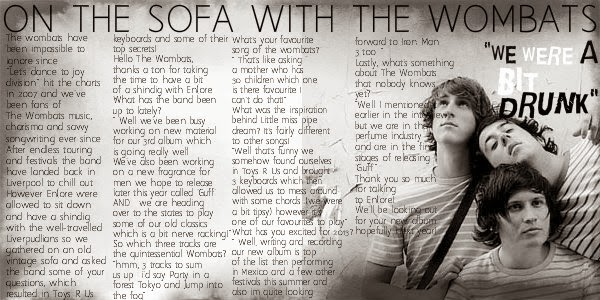
On the sofa with The wombats 

The wombats have been impossible to ignore since "Let's dance to joy division" hit the charts in 2007 and we've been fans of The Wombats music, charisma and savvy songwriting ever since. After endless touring and festivals the band have landed back in Liverpool to chill out. However En(ore were allowed to sit down and have a shindig with the well-travelled Liverpudlians so we gathered on an old vintage sofa and asked the band some of your questions, which resulted in Toys R Us keyboards and some of their top secrets! 

Hello The Wombats, thanks a ton for taking the time to have a bit of a shindig with En(ore. What has the band been up to lately?

" Well we've been busy working on new material for our 3rd album which is going really well. We've also been working on a new fragrance for men we hope to release later this year called 'Guff'. AND... we are heading over to the states to play some of our old classics which is a bit nerve racking!"

So which three tracks are the quintessential Wombats?

"hmm, 3 tracks to sum us up.. i'd say Party in a forest, Tokyo and Jump into the fog"


What's your favourite song of the wombats?

" That's like asking a mother who has 30 children which one is there favourite I can't do that!"

What was the inspiration behind Little miss pipe dream? It's fairly different to other songs!

"Well that's funny we somehow found ourselves in Toys R Us and brought 3 keyboards which then allowed us to mess around with some chords. (we were a bit tipsy) however it's one of our favourites to play"

What has you excited for 2013?

" Well, writing and recording our new album is top of the list then performing in Mexico and a few other festivals this summer and also im quite looking forward to Iron Man 3 too.."

Lastly, what's something about The Wombats that nobody knows yet?

"Well I mentioned it earlier in the interview but we are in the perfume industry and are in the final stages of releasing 'Guff'"

Thank you so much for talking to En(ore! We'll be looking out for your new album hopefully next year!


Friday 1 November 2013

Prototype of my front cover for my music magazine

This is my prototype for my front cover of my music magazine I am rather pleased with how it has turned out as this is my first attempt, however I will change a few things.
I used Pixlr to create my magazine as I have used this before so I knew that it was reliable and would allow my front cover to look more professional. Although I liked to use Pixlr I will try to use some other picture editing software and mix it up a bit, Pixlr has it's disadvantages as it can go blurry and the pictures effects can change when you press the undo button. However it is free and I was proud with my magazine front cover using Pixlr. 

Firstly I had to choose my  genre I was going to go for musical theatre as there was no magazines for this style, however it was difficult to see what sold well because of this. Therefore I chose Indie as that is my favourite genre so I could easily write an article that is targeted to that specific audience. I would like my audience to be between the age 15-32 as from the nrs website I saw that the best selling magazines for the genre of indie sold to people between that age range. 
On my final front cover I will have to take the picture, therefore it will not be of a famous band (what a shame).

I had to pick the name for the magazine and I narrowed it down to two, these where CONFORM and ENCORE, I asked some people of my target audience which title they preferred and they all said ENCORE. CONFORM is still a name in mind as indie stars do not normally conform to rules so it makes it ironic, also it is very different and I think people will like it as it is sort of a pun to the genre of music. ENCORE is a word associated with music and people always want musk stars to perform another song at the end of a performance or show. EN(ORE allows us to see more of what happens to a star like a song at the end of a performance and I didn't want to just type ENCORE as I wanted something a bit different so instead of the C I have used an open bracket. This also suggests that the interviews inside the magazine have some things that are more important than others in addition it makes the audience see that the stars that are being interviewed have some secrets that do not want to be shared, that are sometimes in brackets.

I like the colours of the magazine as it works well with the genre and also it looks professional, when I edit my photo I think I will make it either black or white or a sepia effect. The border around the picture makes it look rough and edgy like the band, I will have to think if I would like to add a different border each issue or keep it the same for each. 

The font of the masthead is different however I think I will change this as it is not my favourite and I think I can find something that will look more effective although it adds connotations. It looks like a stamp so EN(ORE is a statement rather than a word, it is important and it makes it edgy like the genre, on the other hand it doesn't go with the sell lines which I like. 
In addition I like the october 2013 being down the side as it makes it look more expensive and the + allows the magazine to look less cultured. I will probably keep the font of the sell lines as they make the magazine look clean and professional which I think my target audience will like.

I will put the price and the barcode on my next attempt of the front cover as I'm not sure weather it will look good on the front or to put it on the back of the issue like a book. I will consider this when I ask my target audience some questions about the front cover.